Designing for AI - enhancing user experience in an AI personal stylist app.
UI Design
UX Research
Prototyping
INTRODUCTION
With DAPPA’s startup roadmap, the aim of this project was to rapidly explore, prototype and test, and refine core features under a tight timeline.
My Role
UX/UI Designer
My primary focus was designing the home experience and the AI-powered virtual try-on feature, with particular attention to creating intuitive, transparent interactions for AI-driven functionality.
Project Scope
3 UX/UI designers and 2 project managers. 2 months.
Tools
Figma, Notion, Confluence
The Problem
“I have no idea if clothes will fit or look good on me"
From research with frequent online shoppers, I noticed that many users are hesitant to buy clothes due to the lack of confidence they have in the clothing fitting them, looking good on them, or whether it will be cohesive with their other clothes. Which then sparked the question:
How can we recreate the confidence of trying clothes on in-store within a fully digital, personalised shopping experience?
The Solution – DAPPA
DAPPA fashion is an AI-powered mobile app that lets users try on virtual clothes and manage their digital wardrobe
This makes online shopping more efficient, reduces returns, and encourages sustainable fashion by maximising existing clothing.
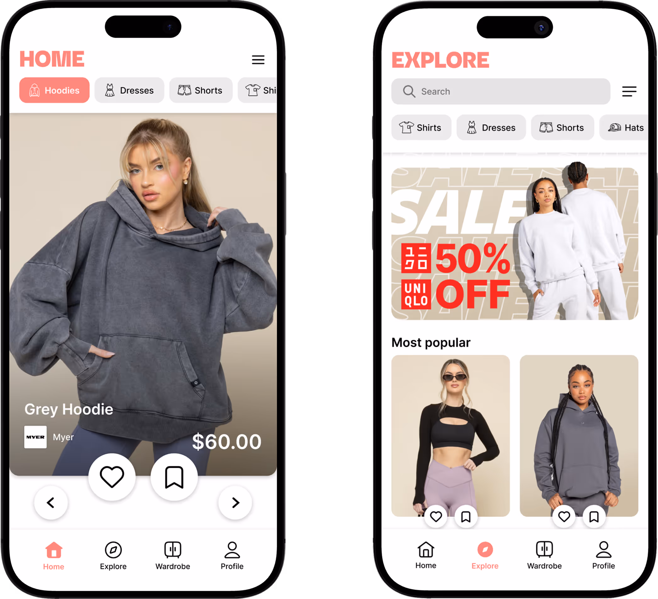
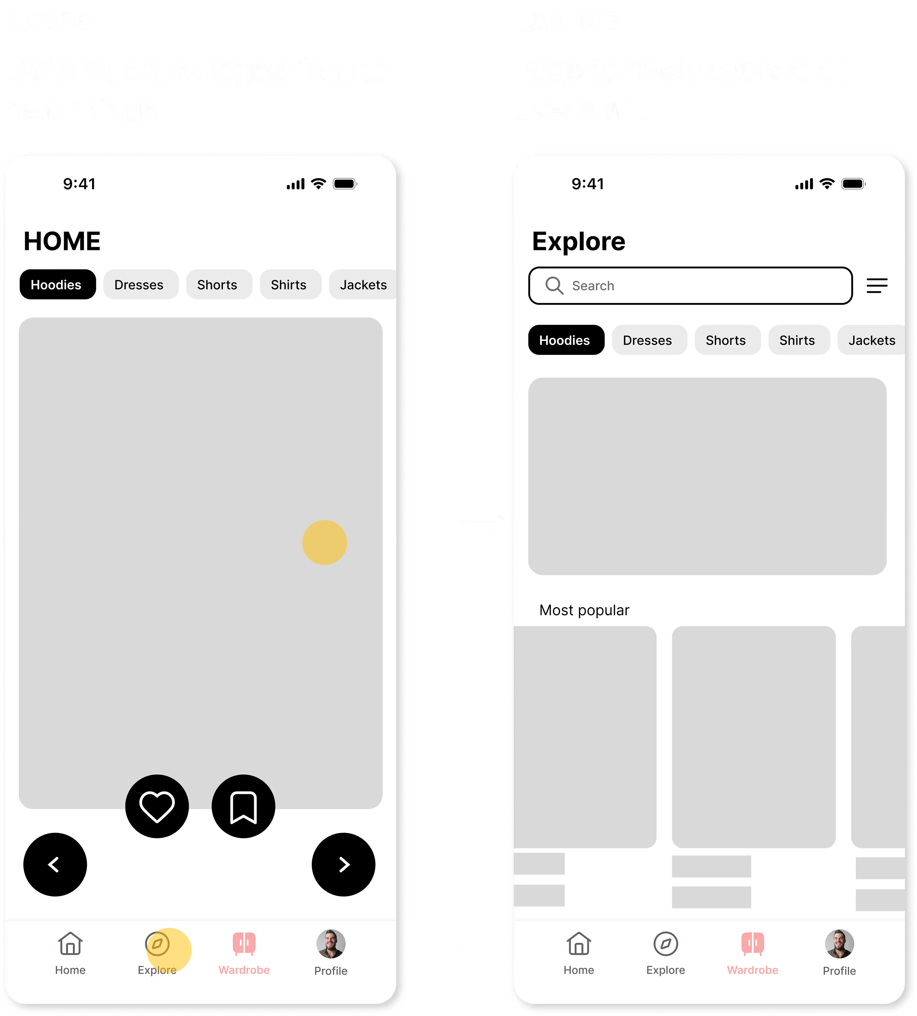
Browse New Clothing
Exploration for new clothes
Simple swiping for new clothes
Explore page for easier access to browsing and clothing
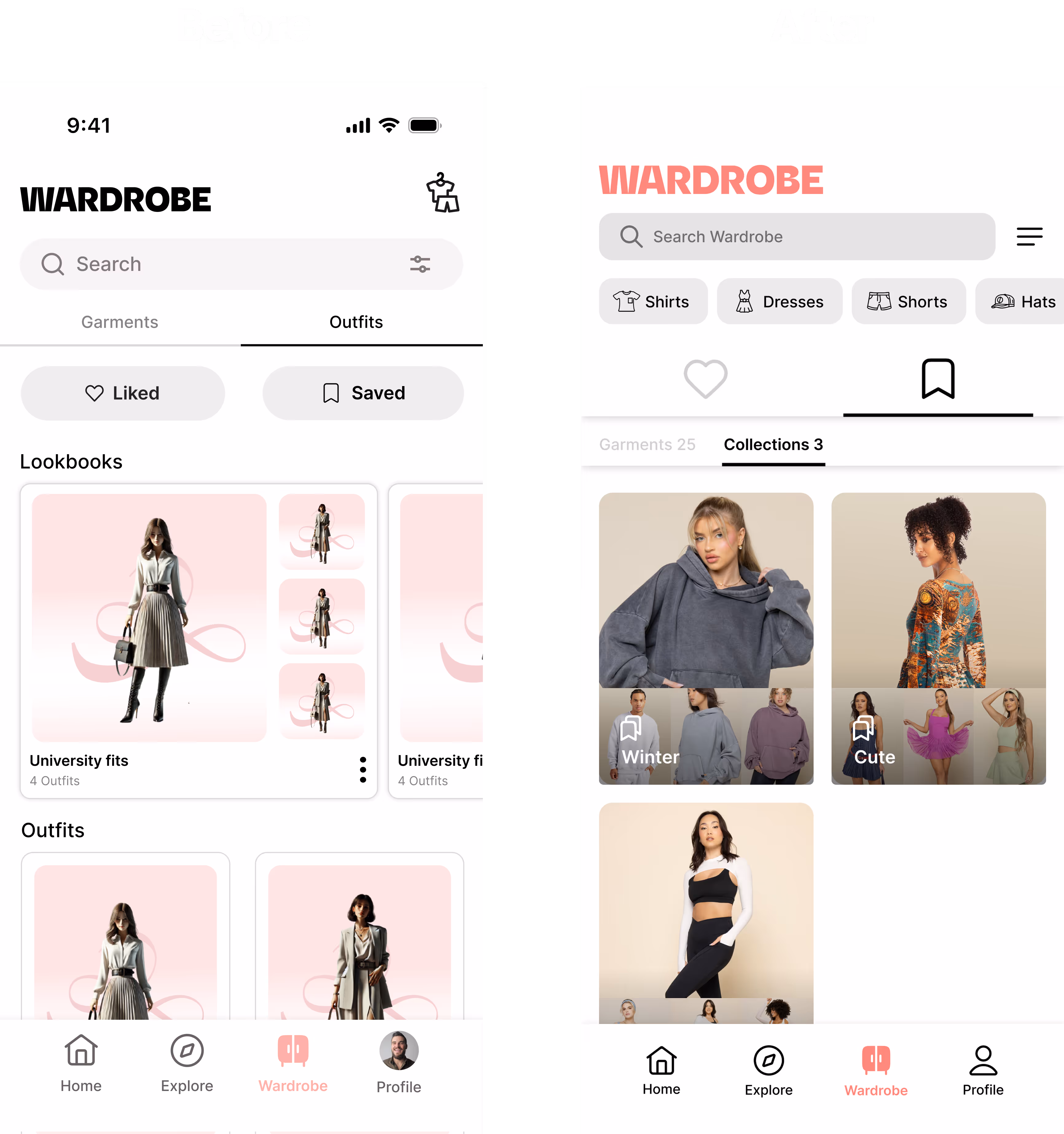
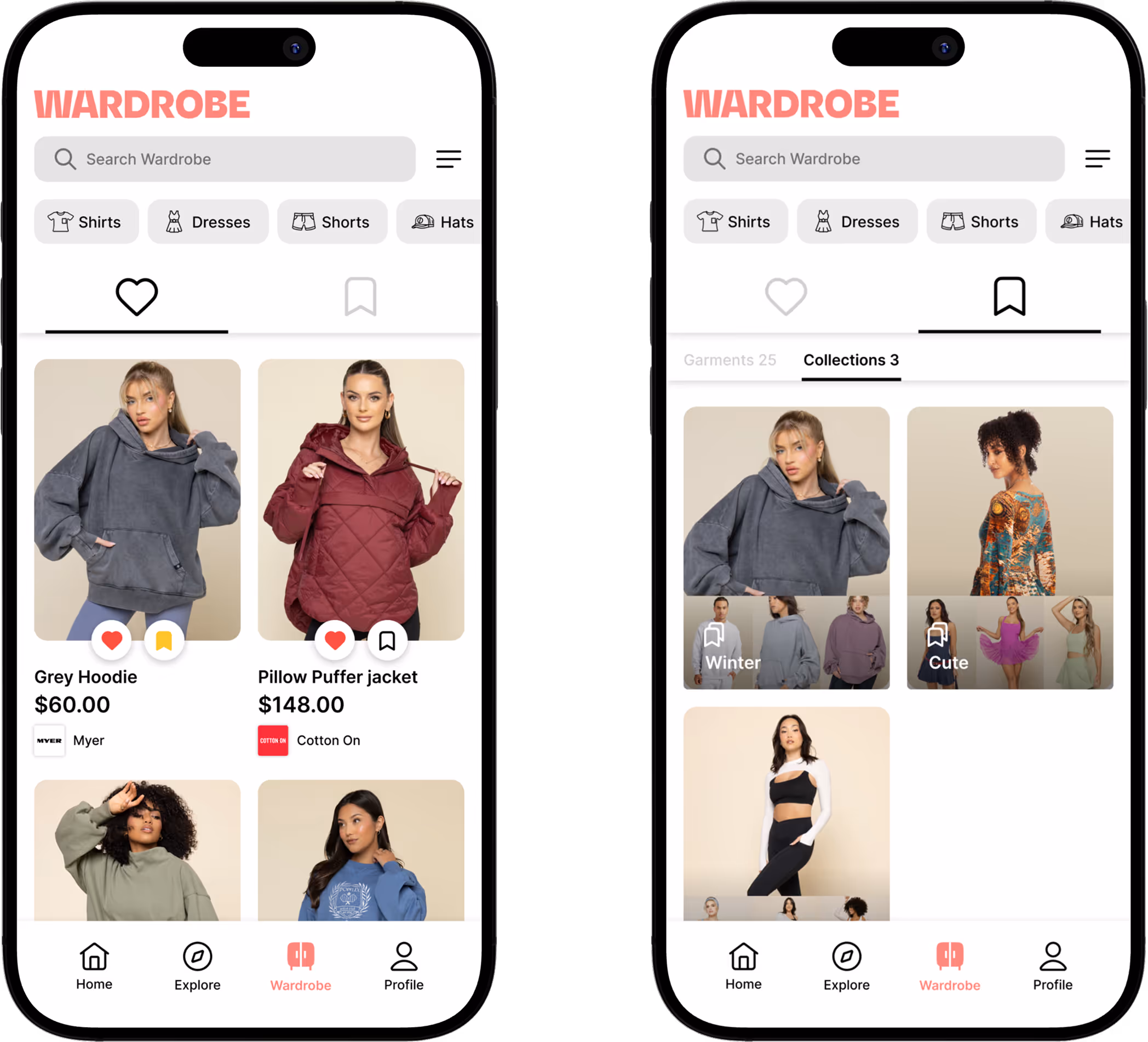
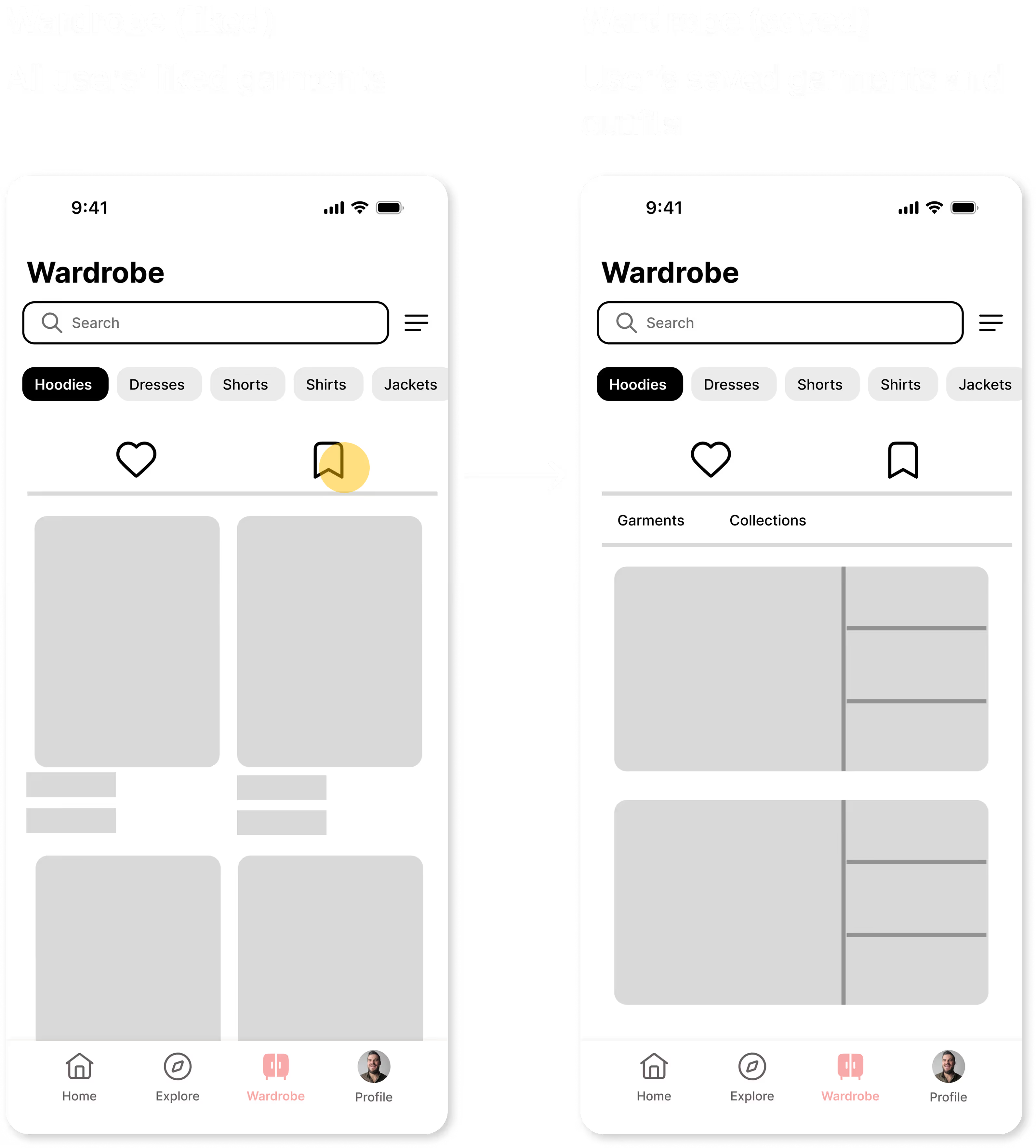
Build your Wardrobe
Digitally keep track of your garments and outfits
Keep track of the garments that you like
Build outfits in your wardrobe and save them
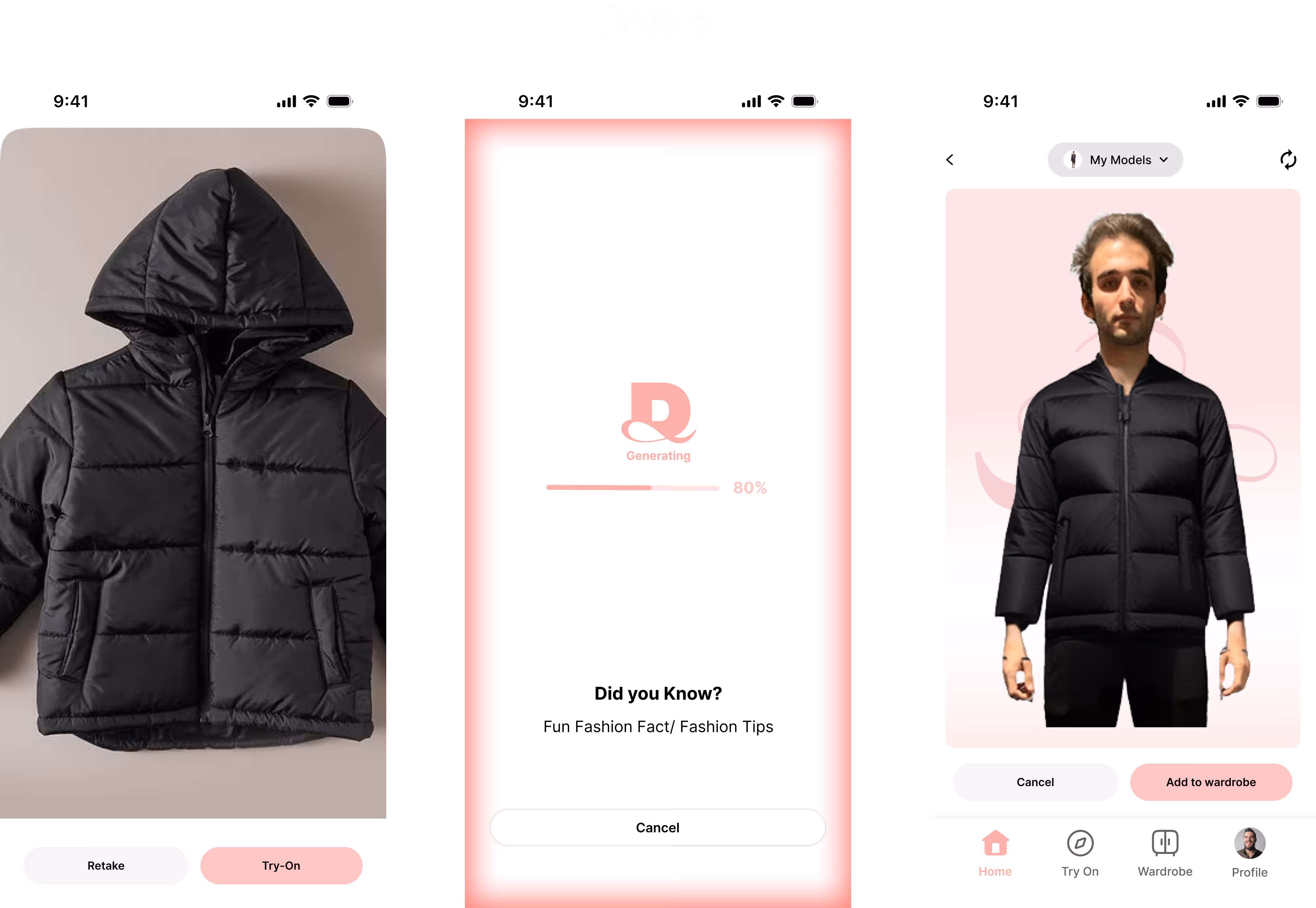
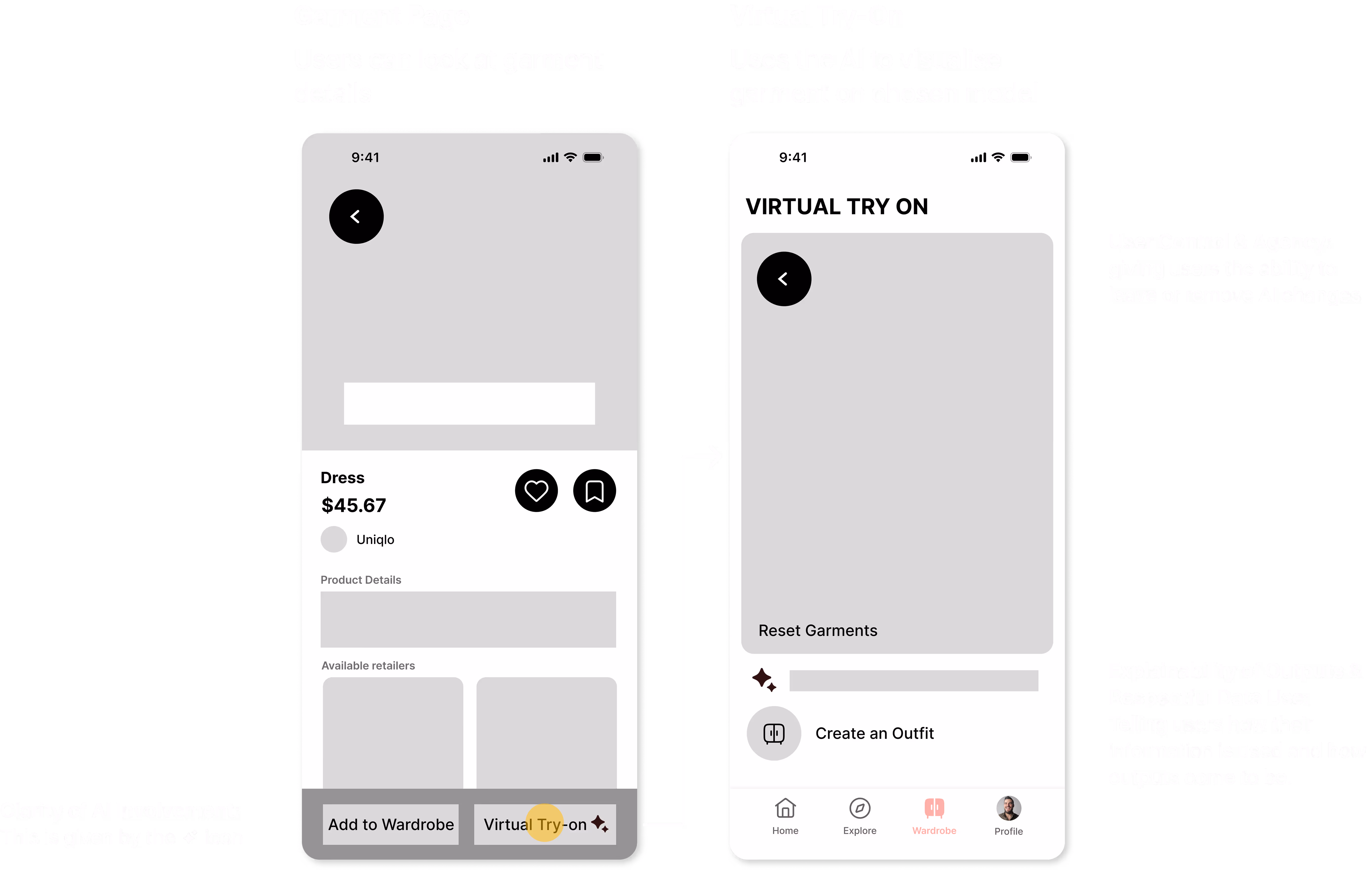
Virtual Try-On
Virtually Try-on Clothes
Check out how clothes look before you buy them
Choose your own model – whether it be for yourself or when buying gifts for others
PROCESS
Competitor Analysis
Competitor apps focus on the point of sale rather than the cohesion of the piece of clothing to the user’s wardrobe
In looking at competitor applications, I identified that they shared similar features to our “virtual try-on”. This also revealed the gap in the market, where this was an opportunity for us to take a different approach from our competitors.
Zyler
Try this fit
Glam AI
Designing for AI
How can we build trust and emphasise transparency in a solution that incorporates AI?
Designing for AI is crucial because it shifts focus from static interfaces to dynamic, evolving human-machine relationships, requiring designers to shape collaboration, manage context, and build trust.
Clarity of AI Involvement
Make obvious when AI is being used and what it is doing, so that users are not questioning or being misled.
Explainability of Outputs
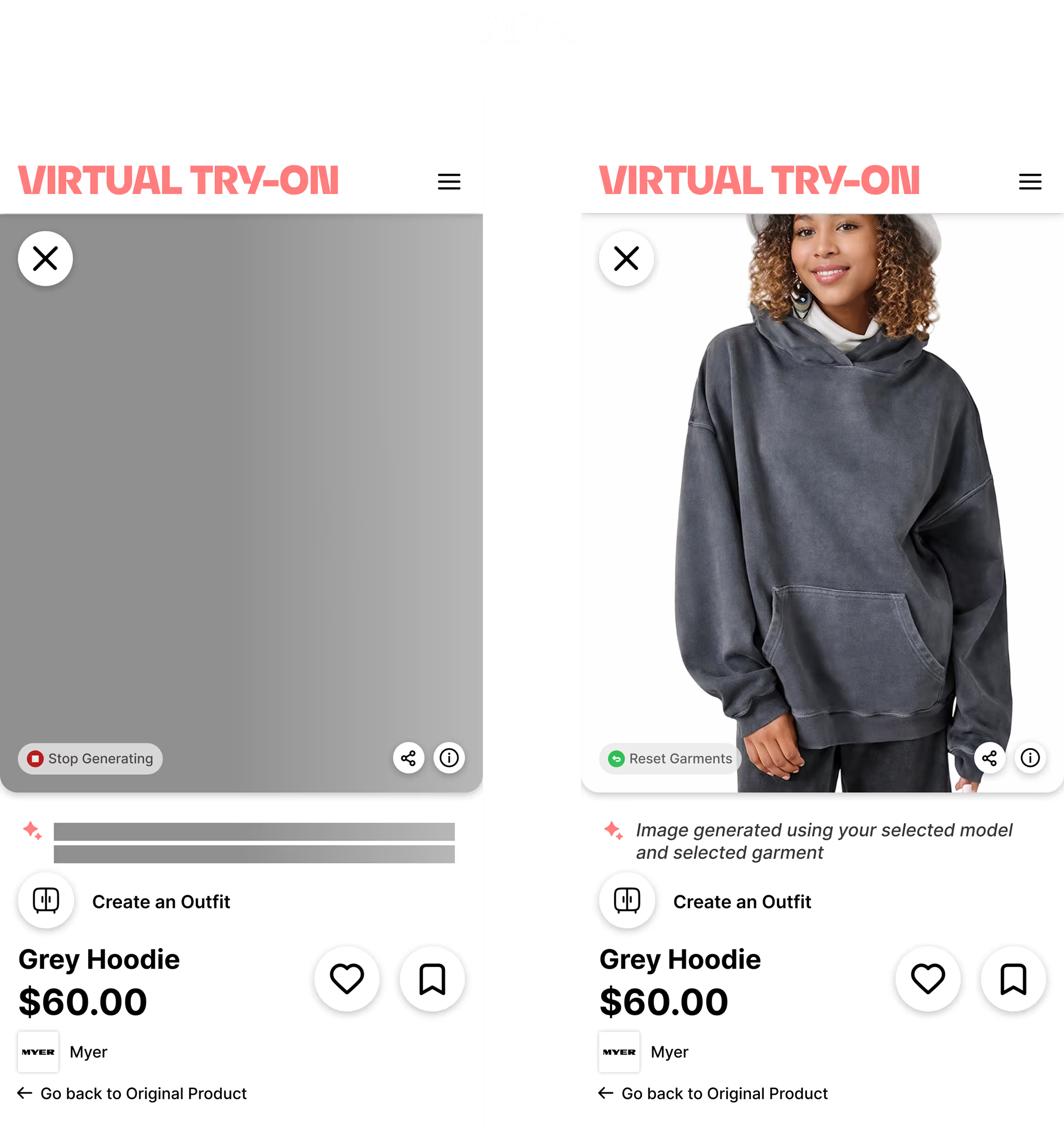
How did the AI make these outputs (for example: “Image generated using your uploaded photo and garment images”).
User Control & Agency
Giving users the ability to adjust correct, override, or opt out of AI-driven decisions.
Transparent & Respectful Data Use
Clearly communicates what data is being used, how it’s used, and giving users control over it.
Persona
Consolidating our ideas with a goal oriented persona
Tina
19
Unsure Shopper
She wants to change up her style however she is hesitant because what if what she buys doesn't match her existing wardrobe?
User Flow
Consideration for our persona's context directed a user flow focusing on minimising steps and time
Since the focus was on the virtual try-on functionality, I wanted to create pathways so that users could easily access and utilise the most important features of the app with the least amount of frictions.
Wireframes
How can I encourage exploration?
How can users manage the cohesion of the clothes they buy with their wardrobe?
How can I be transparent and build trust with users for an AI solution?
In designing this flow, I remembered "Designing for AI" – focusing on the four design challenges I mentioned before hand.
Design Success Criteria
How do we know whether our designs work?
During usability testing, I evaluated the designs against our success criteria to assess effectiveness, uncover usability issues, and guide informed design iterations.
Iterations from usability testing
1. Removing Bottom Navigation
Having the navigation bar along with the primary feature was distracting and overwhelming to users.
2. Changing button weight
Having 2 primary buttons on the same page was visually distracting and distracted from the main feature (virtual try-on).
Iterations from Original
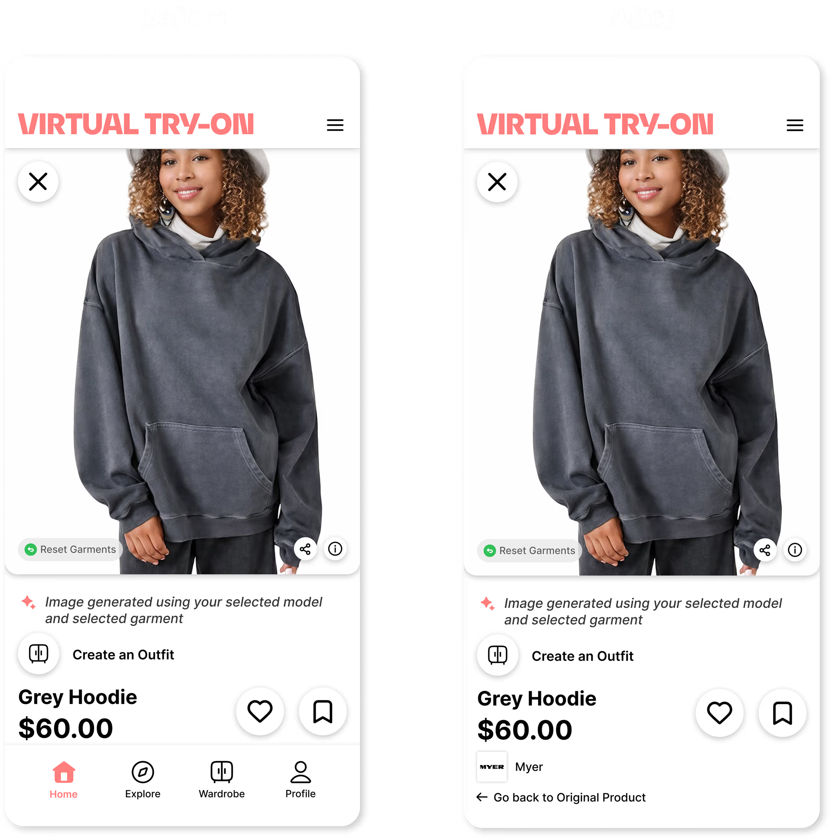
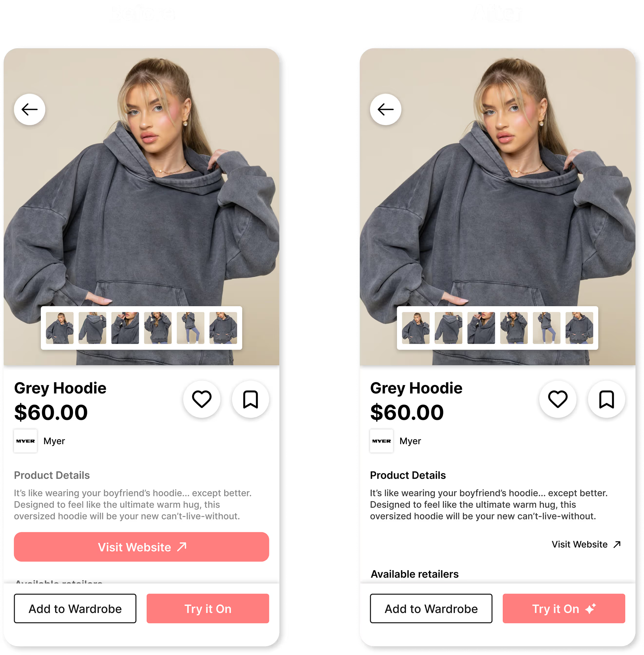
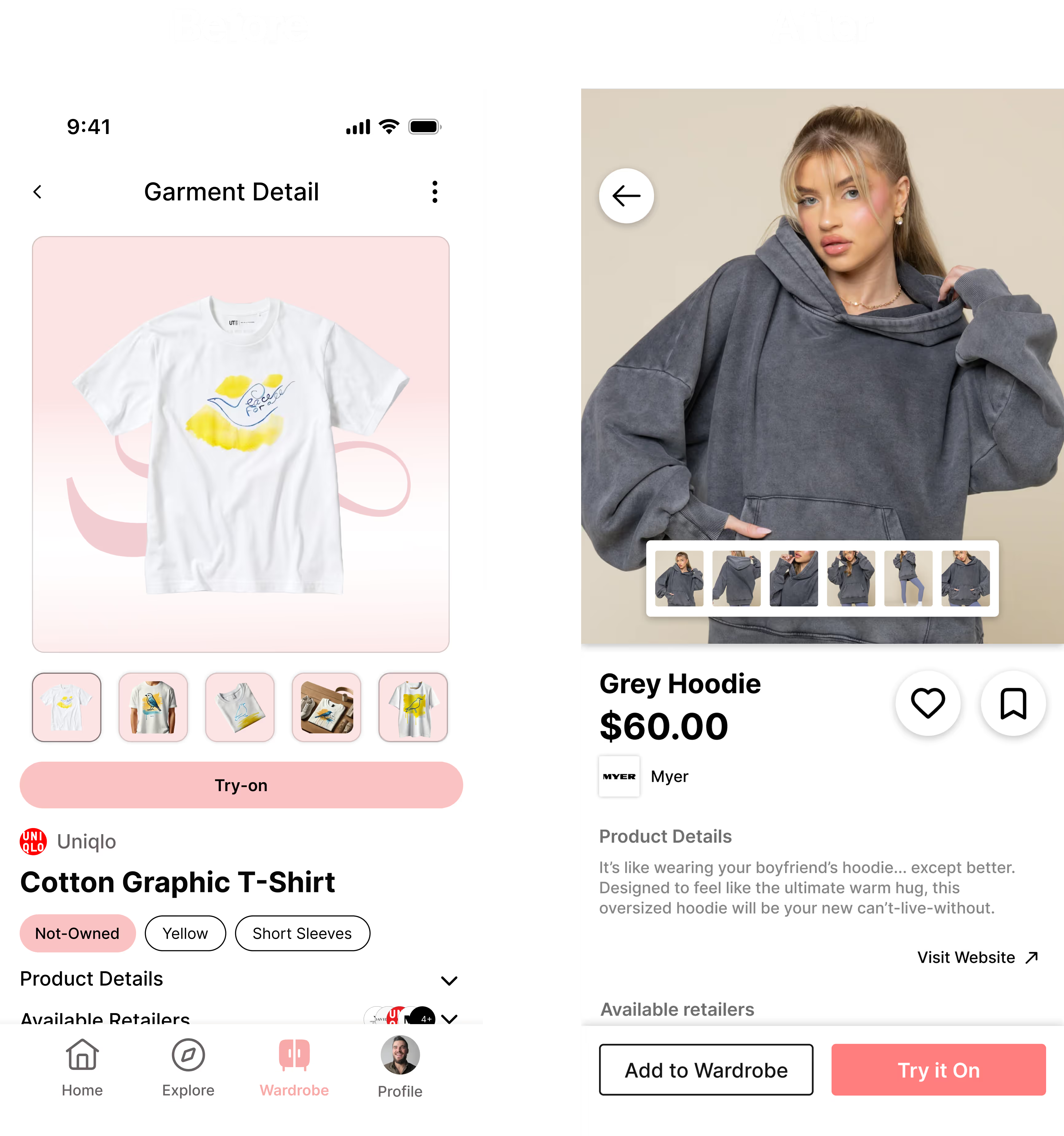
What it was before and what it is now
My new designs focused on a more modern interface with clearer icons
Here, the new version incorporates the "Designing for AI" changes needed for user trust and intuitiveness. Further, the new version uses fewer pages than the original, making user flows more efficient.
Some other noticeable changes were made to the colour and structure, simplifying it and making a cleaner design.
Final Frames
Home Page & Exploration
Wardrobe
Virtual Try-on
IMPACT
My Impact
How my work impacted the project
Conducted A/B testing on target audiences and iterated on prototypes, increasing success rate by ~20%.
Designed and refined core AI features, including the home screen interface and virtual try-on.
Collaborated with project managers and other UX/UI designers to refine components and optimise key user flows.
Key Learnings
The lessons I took from this project
Balancing design ideas
Clashing opinions and ideas required open communication and compromise to find suitable solutions.
Team tensions
Moments of team tension taught me how to navigate interpersonal conflict and work collaboratively.
Confusing information
Confusing information pushed me to ask questions and break down complex ideas into simple, actionable steps, helping to exercise my problem solving skills.
Design pivot
Midway through the project, we helped inform a shift in direction from our user research. I quickly adjusted our designs, and iterated on wireframes, to better accomodate for this sudden change.

.jpg)


.avif)