Rebranding and re-design of the company website - driving lead generation.
Branding & Logo
Web Design
Competitor Analysis
INTRODUCTION
One of my first tasks in my TAMSO internship was to redesign and develop their main website and update the company’s branding.
My Role
UI Designer, Graphic Design, Web Developer
I was responsible for end-to-end ownership of the company’s brand, visual identity, and website, leading ideation, structuring the design approach, and presenting outcomes to stakeholders.
Project Scope
Individual project. 3 months.
Tools
Figma, Webflow
The Problem
TAMSO’s previous website did not effectively communicate the company’s current services, nor did it fully showcase the company’s creative capabilities.
Additionally, the company’s brand and visual identity were quite bland and difficult to distinguish in a competitive design market.
The Solution
A fully re-branded and re-designed website
Within my 3-month internship at TAMSO, I was able to complete TAMSO’s new website concurrently with my assigned work. I had:
Most agency websites communicated their expertise through creating experiences for their users.
The best design agency websites had micro-interactions and subtle design details throughout the website. This was something that I was excited to incorporate into the website.
Brainstorming
How could I design a website with stronger creative impact?
To better understand my own thoughts, I jotted down my ideas into a brainstorm.
These thoughts were drawn from not only the competitor analysis, it also came from stakeholder thoughts as well as my own creative thinking.
Design Challenges
Narrowing it down and being more specific
To narrow down my ideas, I thought of the different features that I could include and the intended impact.
Keeping in mind that I wanted to position the company as a creative, goal-oriented as well as approachable design agency, the following is what I came up with:
New Branding
A new logo and brand will help to position the agency as a competitor in the market – different from the rest as well as memorable.
Subtle Decorations
Subtle decorations in the background to show creativity while adding subtle complexity through layering.
Purposeful Language
Using intentional informal language can help the agency seem more friendly and approachable.
Cool Micro-interactions
This can show attention to detail and creativity. Positioning the agency that cares about the little things.
Branding
What makes TAMSO unique?
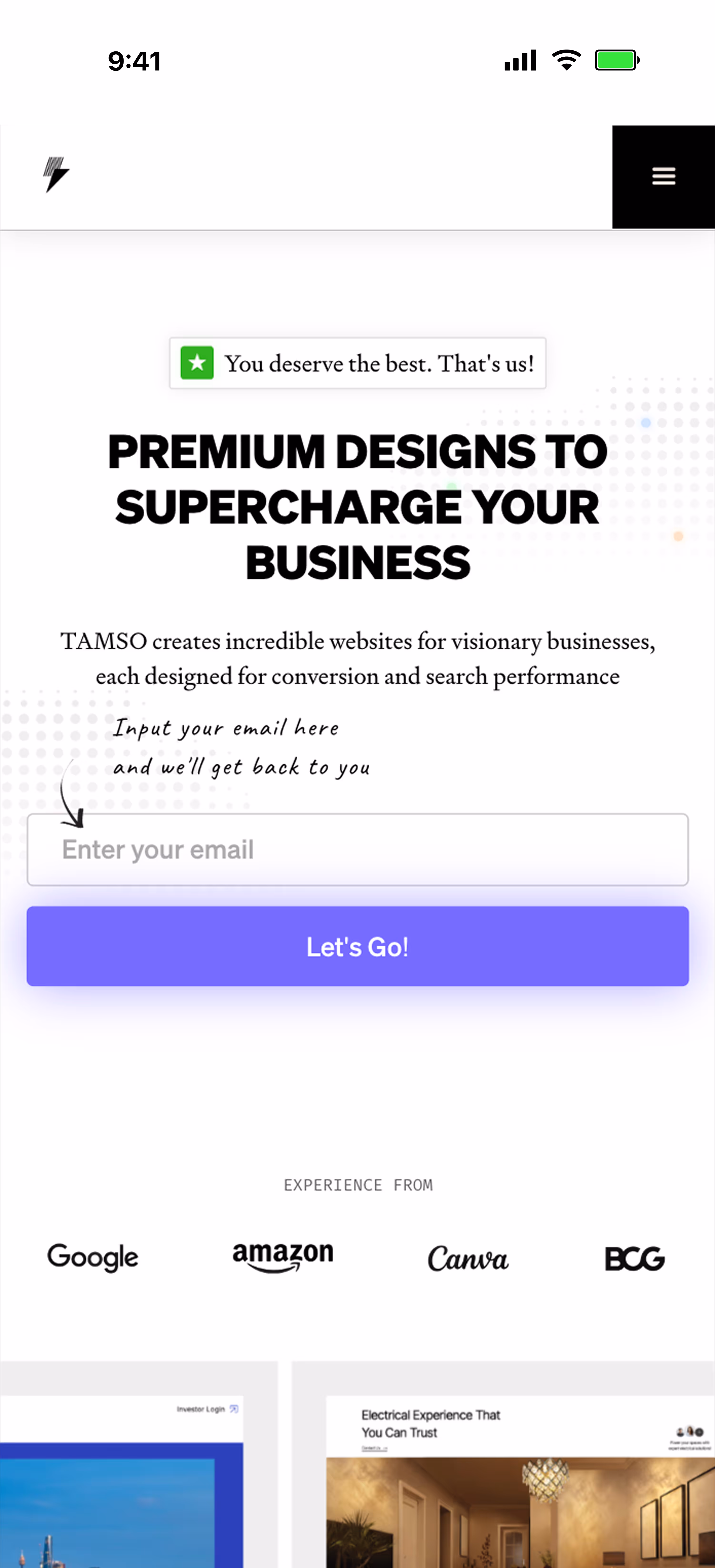
TAMSO is a design agency that prides itself on “faster than average website design and development whilst still maintain high quality”. This, in combination with the tagline of our website “SUPERCHARGE YOUR BUSINESS” helped me come up with the ideas.
In addition to the logo, I had created some other assets to allow stakeholders better understand the brand its aesthetic.
Introducing...
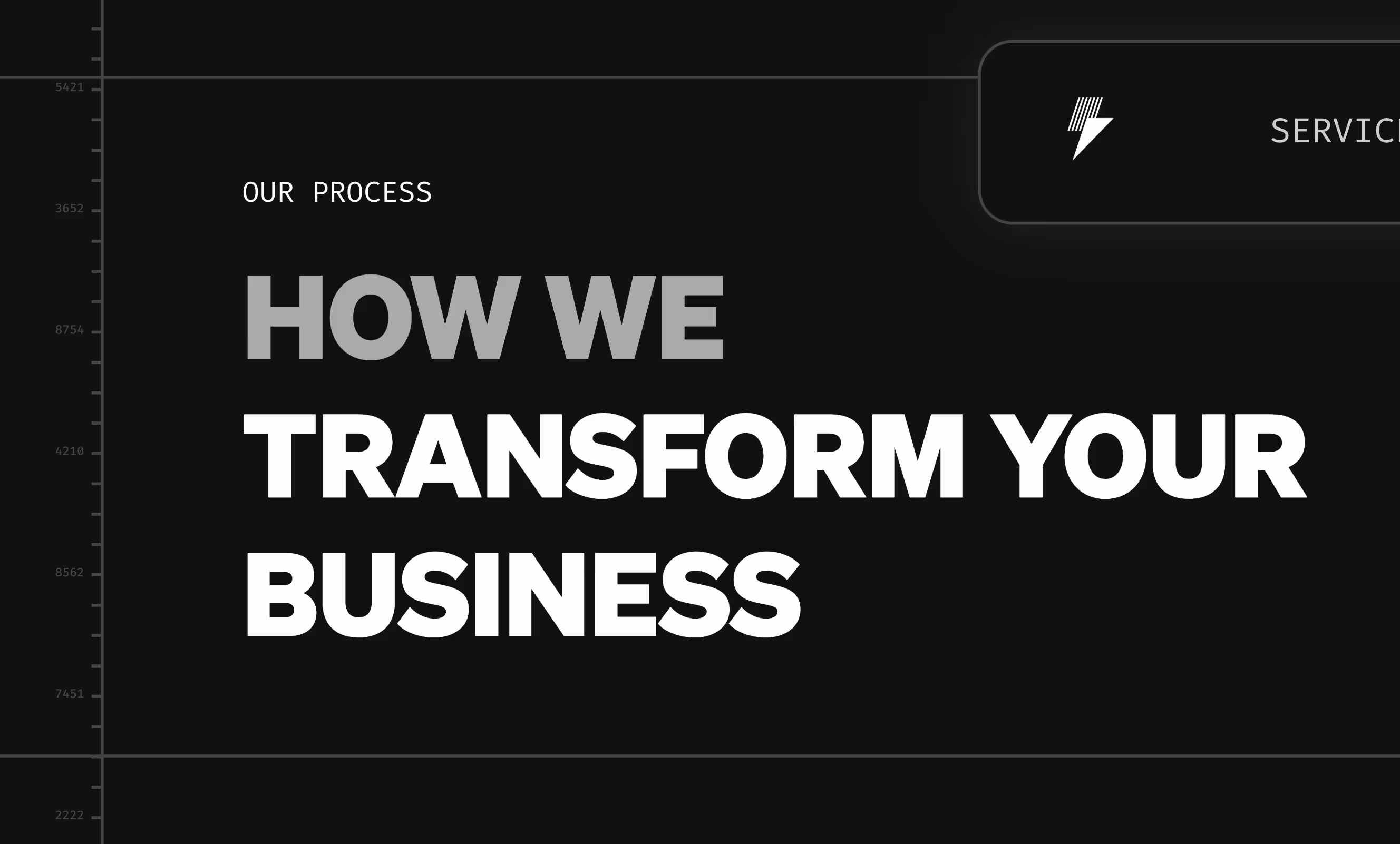
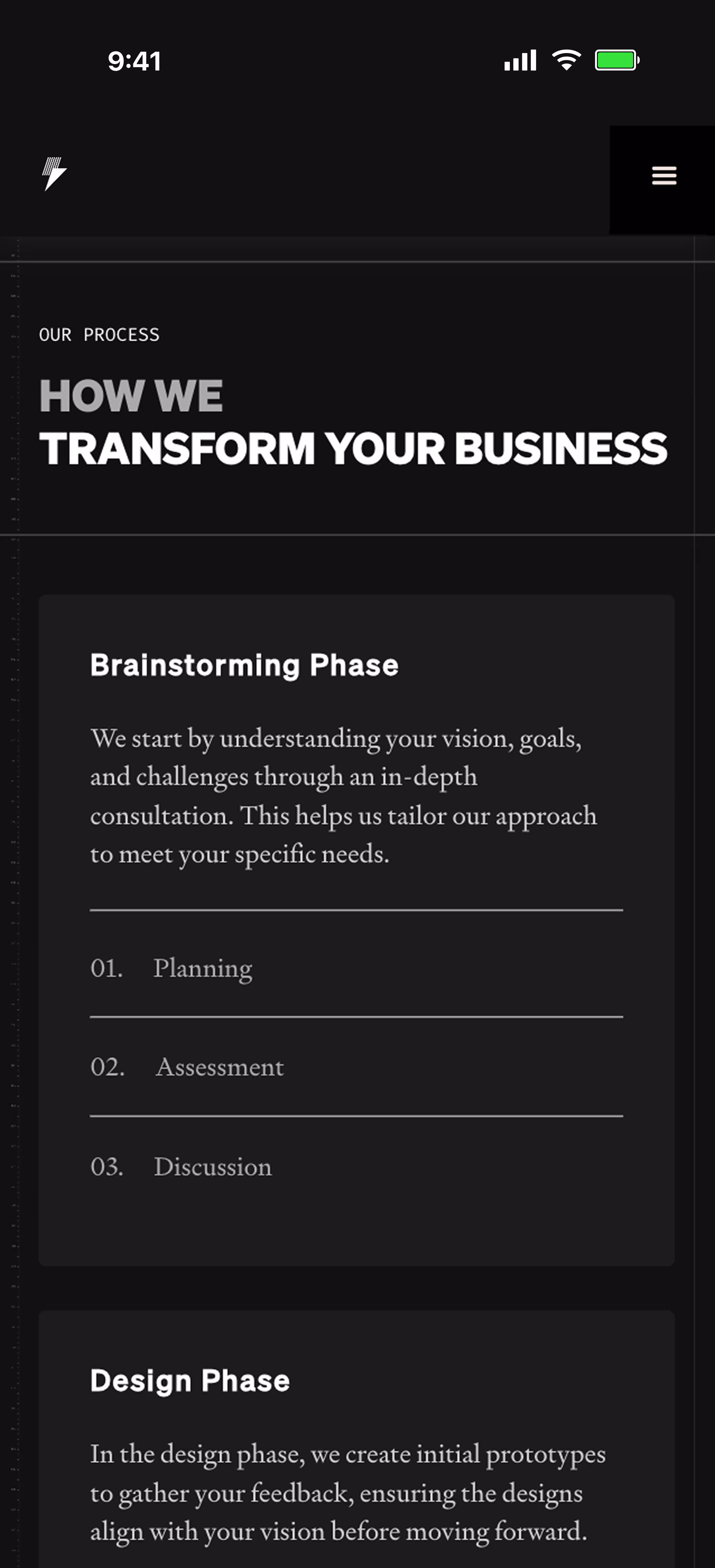
Planning
Mapping out the details of the website
Firstly, I worked with my manager to establish the structure of the website on Relume.
Then, I identified areas where I could add the small details – subtle details and micro-interactions that show attention to detail and positions us strongly as a design agency.
1. Scroll animation
Scroll-based interactions added dynamics to the experience, enhancing overall user engagement.
The changes reflect the company’s design process.
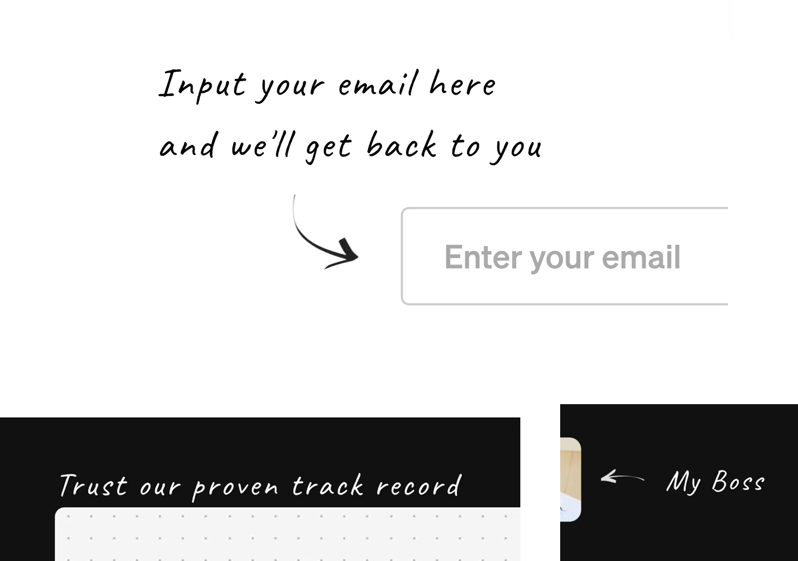
2. Colloquial Language
Introducing casual language throughout the website created a more playful and approachable tone.
3. Visual Details
I loved the idea of having a number line as a margin on the website. It suggests precision and attention to detail.
Development
Webflow build and executing the plan
The most difficult aspect of the build was adapting for tablet and mobile.
Some details, such as the scroll animations, needed to be altered or fully removed for the website to be responsive across various devices.
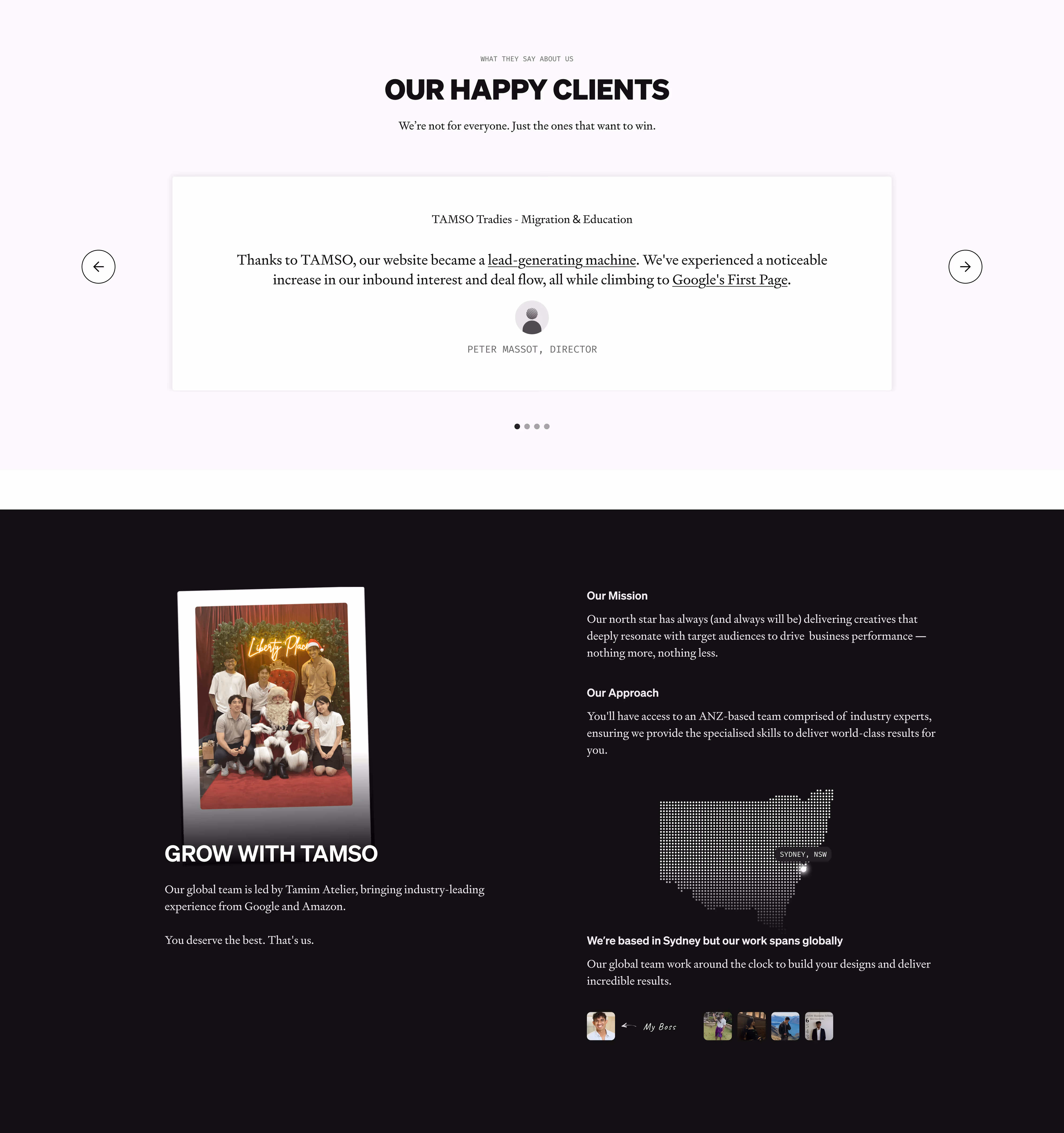
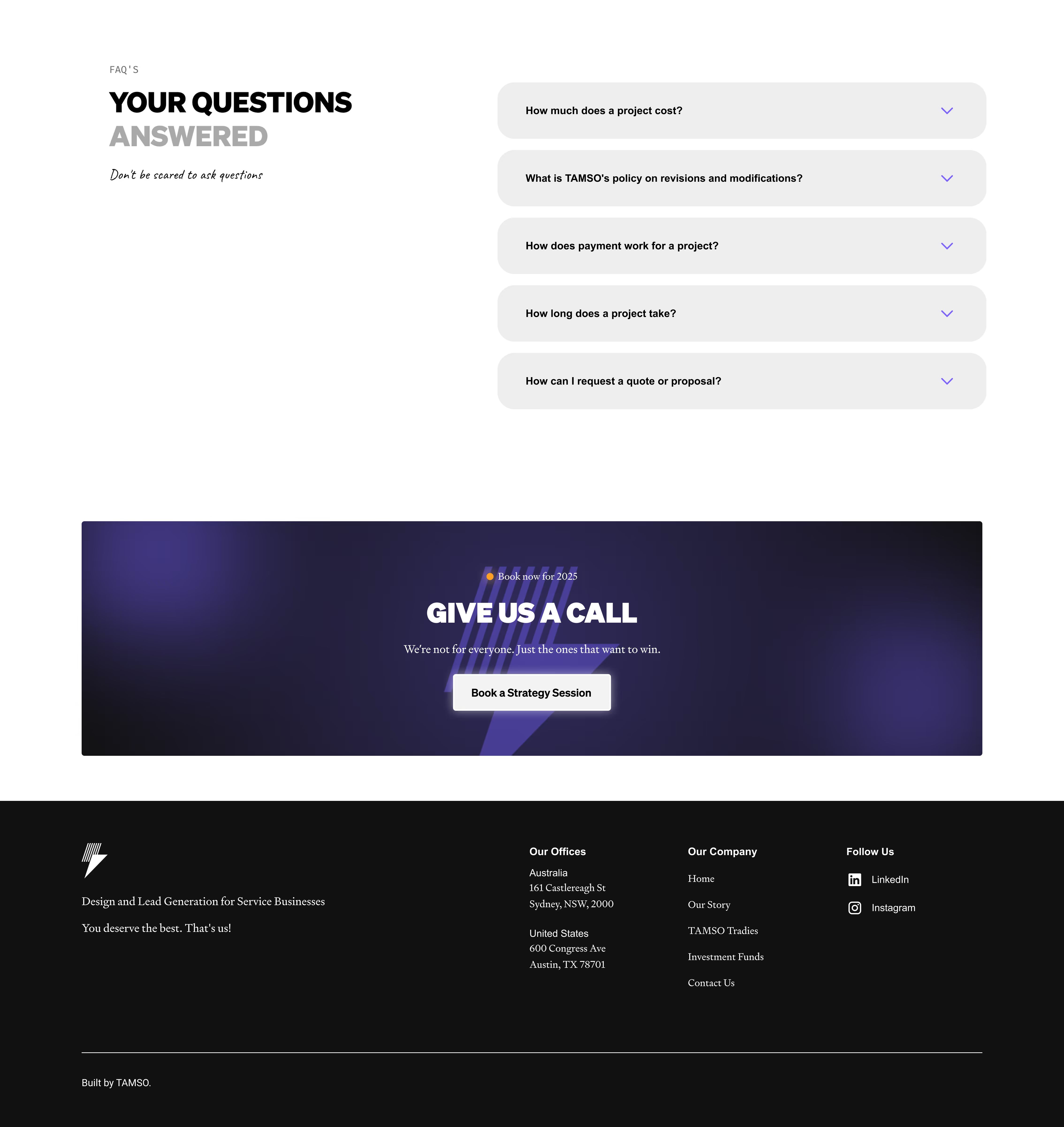
Final Outcome
An especially catered, responsive website that communicates design services and conveys design skill in a friendly and approachable tone.
An overview of the final website.
IMPACT
My Impact
How my work impacted the project
Fully re-designed and built TAMSO’s website and brand identity, improving usability and visual consistency.
Audited previous website to identify usability, content, and visual hierarchy issues in relation to competitors.
Delivered a modernised and responsive website aligned with updated brand positioning.
Key Learnings
The lessons I took from this project
Balancing Design Ideas
There were features I was excited about that the client ultimately did not find suitable for their brand. This required me to step back, re-evaluate the design, and ideate new solutions.
Creative Expression
This project really helped me to understand creative expression on websites to enhance the user experience and how to apply them in development.