


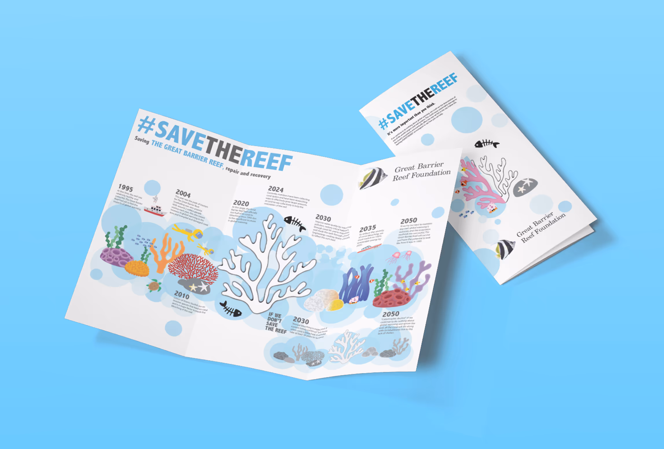
#SAVETHEREEF is a global movement dedicated to raising awareness and driving action to protect the world’s largest coral reef system from threats such as climate change, pollution, and destructive human impact.
This project was completed individually, showcasing both my graphic design skill and proficiency in Adobe Illustrator. I aimed to create a compelling visual story that effectively communicates an important environmental message.
Role
Graphic Designer
Collaborators
N/A
Tools
Adobe Illustrator, Photoshop, ChatGPT, Figma
Duration
3 months
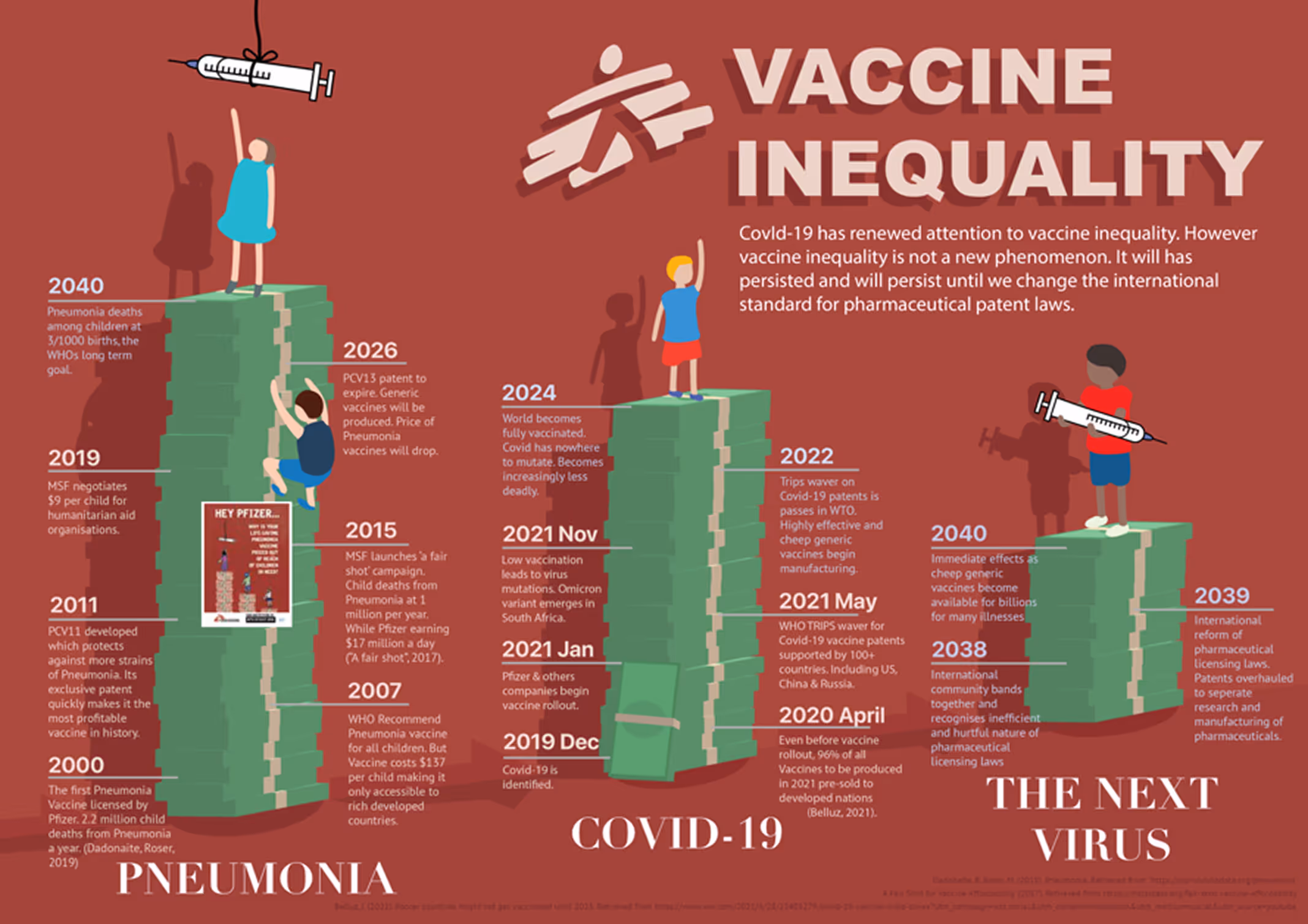
THE PROBLEM
Since 1995, the Great Barrier Reef has been increasingly under severe threat due to climate change, pollution, and human activities, yet public awareness and action remain limited especially among younger audiences.
.jpg)

Discover
Understanding the problem and gathering insights.
background research
Firstly, I wanted to scope out the Great Barrier Reef Foundation’s website and understand what they do and how they are protecting the reef. This included learning about coral bleaching, exploring their ongoing projects, and the key environmental threats they are addressing.
In this process, I considered what would visually captivating and informative. For example:
In this process, I considered what would visually captivating and informative. For example:
Coral bleaching and ways to portray coral bleaching as a visual transformation over time to highlight the severity of its impact.
Cloud brightening, which involves enhancing cloud coverage to reflect sunlight from the reef, might be visually unique and beautiful.
Gradual increase and impact of pollution on the GreatBarrier Reef.
audience
For this project, I wanted to target younger audiences by creating bold, eye-catching, cartoon-like visuals and using clear and engaging messaging that would resonate with their values. The goal was to spark curiosity and encourage them to take action in protecting the reef through education and awareness.
With establishing this as our target audience, I thought that a vector art style would be suitable. Although I wanted to create a poster, I also considered the importance of alternate placement and contexts, and the different forms the artwork could transform into.
With establishing this as our target audience, I thought that a vector art style would be suitable. Although I wanted to create a poster, I also considered the importance of alternate placement and contexts, and the different forms the artwork could transform into.

Posters & Print
In the classroom, digital websites and/or brochures handed out at museums and aquariums.

Public Advertisements
Light rail ads or transport ads near the Sydney aquarium that connect marine conservation with a high-traffic areas.

Social Media
Instagram stories and posts that connect the message to a wide audience beyond Australia.
inspiration
After deciding my style and audience, I went online to scope out some inspiration. I looked at vector artworks and how they use bold shapes, gradients, and minimal detailing to convey complex ideas in a visually appealing and accessible way. This helped guide the visual direction of my poster, ensuring it would stand out while remaining easy to understand.

Define
What am I creating?
Design timescapes

A novel visual thinking tool that not only challenges designers to visualise the relationships between design and societal shifts but encourages the development of visual argumentation for design proposals” – Clare M Cooper
I decided to use a “Design Timescape” to emphasise the change over time, particularly focusing on the ongoing environmental degradation of the reef and potential future interventions. This allowed me to visually map the progression of coral bleaching and highlight the urgency for sustainable action, while also showcasing how this degradation occurred as well as innovative solutions like cloud brightening that could influence future outcomes.
Here are some examples of design timescapes:
Here are some examples of design timescapes:
key content
At this stage, I wanted to establish a clear timeline and facts. This included identifying key events affecting the reef, such as major coral bleaching incidents, restoration efforts, and scientific developments like cloud brightening. By mapping these milestones, I aimed to create a narrative that was both educational and impactful.
Considering the nature of a design timescape, I needed to draw from the past, present, and future. To anchor the viewer’s attention, I would want to choose a striking depiction of the reef’s current degraded state at the centre of the poster. This served as a powerful focal point, highlighting the urgency of the issue and framing both the historical context and potential future pathways around it.
Considering the nature of a design timescape, I needed to draw from the past, present, and future. To anchor the viewer’s attention, I would want to choose a striking depiction of the reef’s current degraded state at the centre of the poster. This served as a powerful focal point, highlighting the urgency of the issue and framing both the historical context and potential future pathways around it.

Develop
Some sketches, elements and the artwork.
initial plan
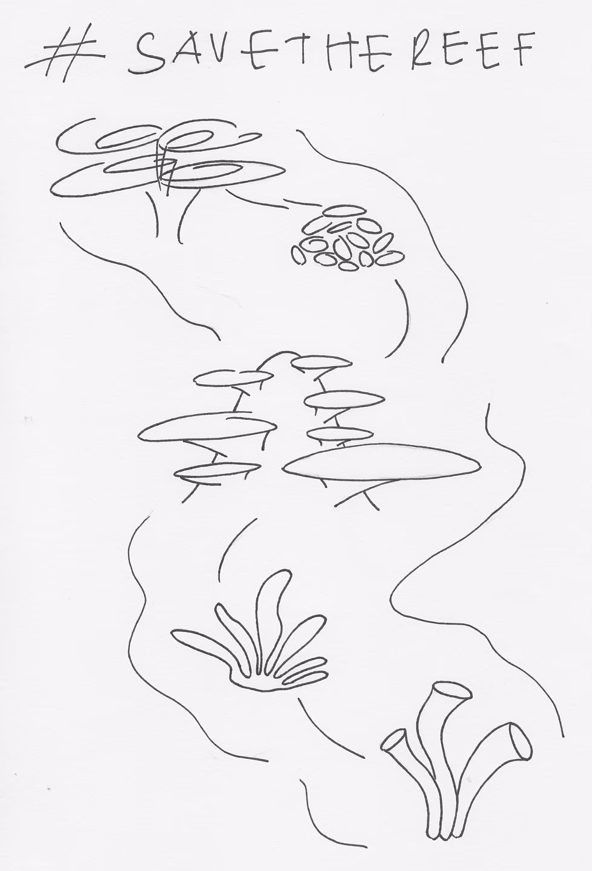
For my initial plan, I sketched an overall image of what I wanted the final product to look like. In the centre, there would be a large piece of bleached coral that would be the salient element of the poster and represent the current state of the reef. Flowing through the central image, a watery path would guide the viewer’s eye from the past to the present and into the future, visually representing the passage of time. This allowed me to create a narrative arc within the layout, showing both the damage that has occurred and the potential for regeneration through action.
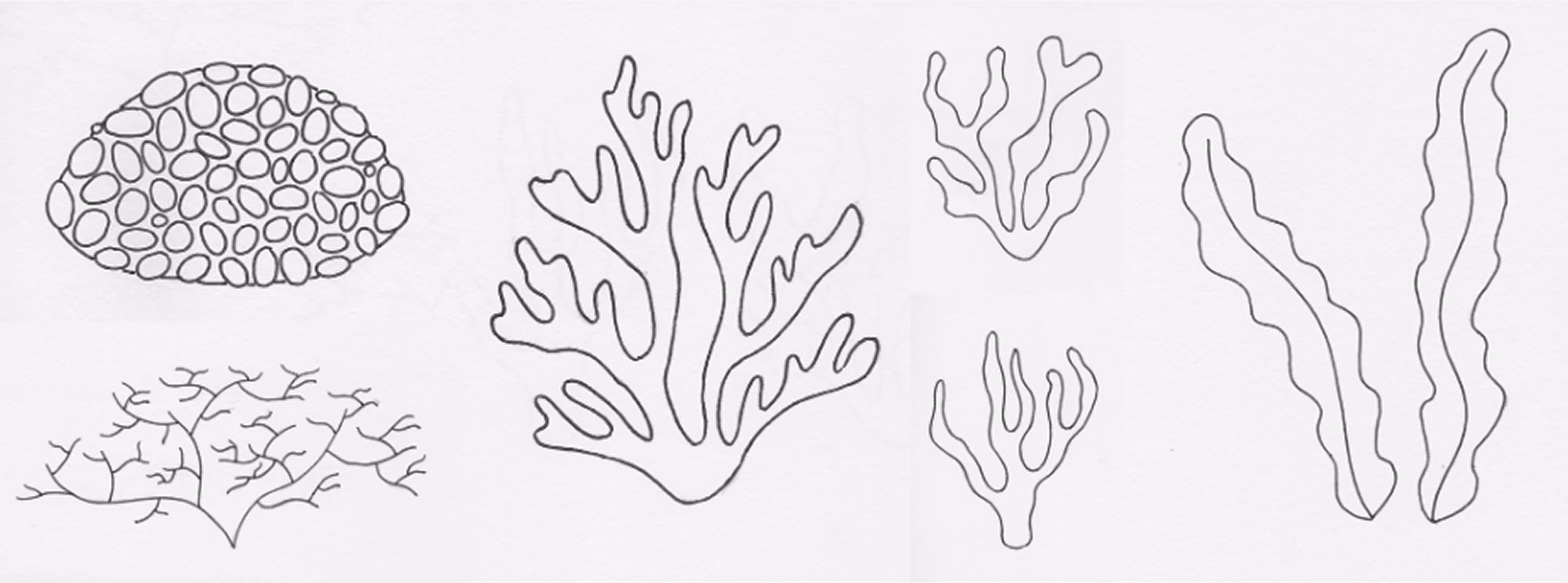
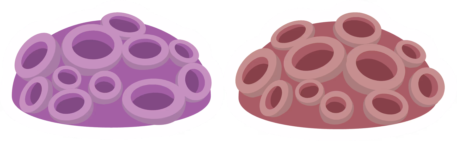
SKetches
These are some of the coral sketches that I drew.

Deliver
Finalising and sharing the solution.
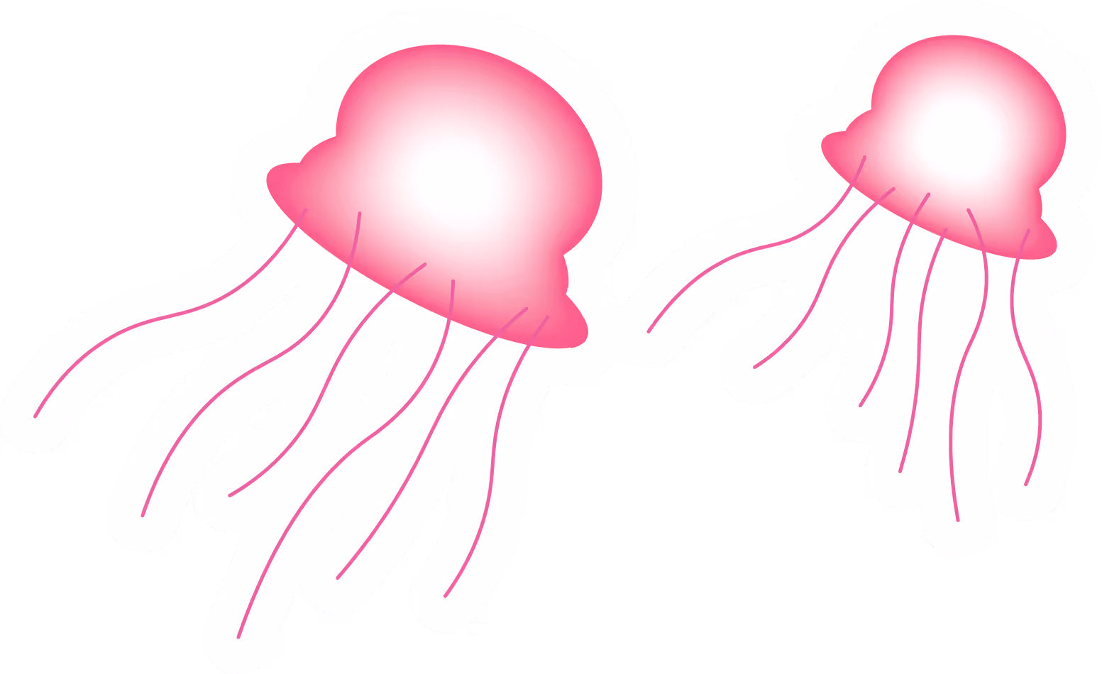
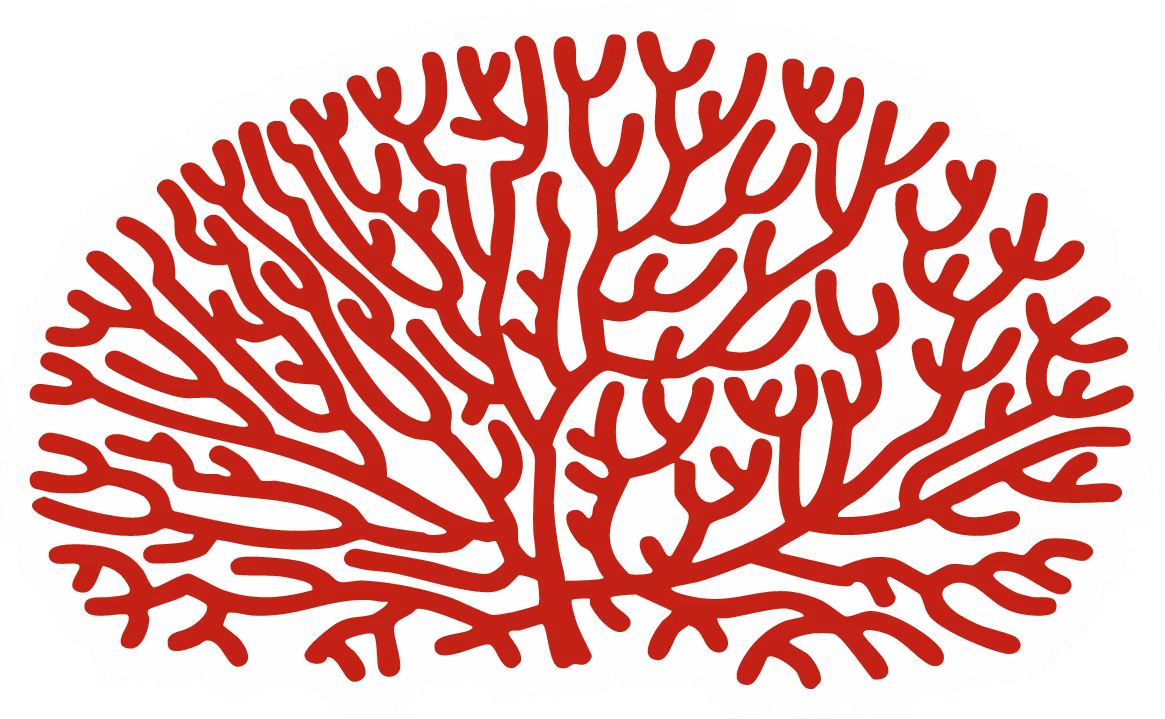
ASSETS
These are the assets that I created for the artwork using Adobe Illustrator. I wanted to maintain the flat vector design aesthetic as it aligned with the values of my target audience.


Background Design
To portray the "flow of time" in the background, as outlined in my initial plan, I decided to use a series of overlapping circles that also resembled bubbles. This design element not only suggests the movement of time, but also is visually tied into the underwater theme and provides depth in the artwork.

Text Contrast
An adjustment that was made to the artwork was the text font styles. Originally, texts that corresponded to areas where coral bleaching were involved, the text mirrored this "bleaching", being white with black outlines. However, it was found that this hindered readability and caused an imbalance in typography. As a result, these texts were turned to solid black and prioritised readability over a creative expression.
Final Design
The final artwork and design is a poster made to be presented as a poster. From here, the artwork can be altered to be displayed in different forms.
Mockups
To create my mockups, I used ChatGPT to generate mockup templates, which I then refined and completed using Adobe Photoshop's generative expand and warp tools.
I took note that in public settings, a purely flat design might appear out of place or feel immature. To address this, I imagined a potential partnership with Sydney Aquarium, combining my illustrative aesthetic with their visual branding and using real images. This approach helped create a more impactful and visually cohesive presence, particularly within a city environment.
I took note that in public settings, a purely flat design might appear out of place or feel immature. To address this, I imagined a potential partnership with Sydney Aquarium, combining my illustrative aesthetic with their visual branding and using real images. This approach helped create a more impactful and visually cohesive presence, particularly within a city environment.
challenges & takeaways
Some of the challenges I faced in this project:

Designing for Different Contexts
Creating realistic, professional looking mockups was quite difficult to balance considering flat designs can sometimes looks awkward if not integrated well. To overcome this, it was a matter of multiple iterations and drawing inspiration from the real world.

Simplifying Complex Information
Distilling scientific and environmental data into simple and digestible visuals was initially challenging. The designs needed to be both accurate and accessible, especially when designing for children.
